
Here is an introduction of stocks and stock trading where we are going to learn about the stock market and more specifically how to trade the market. Now the concept of stock market and trading might be brand new to you or might be in school or you never had an interest in the market; whatever type you belong to this is kind of introduction to the market, what it’s about and then some other basics of trading.
So now let’s get more into the technical details of how the market works, and how you can actually trade and be a trader in the market. Let’s just starting off by looking at this chart.
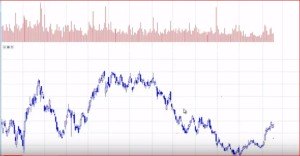
Looking at this you might not even know what you’re looking at; well basically what this is it’s called the stock chart and it tracks the movement of the stock that it’s tracking, which, in this case, is Ford. Ford is a very popular car company and the car company has stock and you can actually follow and track how the stock has been performing. To take it even on a more basic level,just remember that many companies have their own shares out in public where people like you and me can actually own part of the company and other publicly traded companies like Ford, Disney, you name it.Basically if the name is big enough it’s probably traded in the stock market and you can actually be the owner on a small level by owning some of the stock.
Now, what people like to do is actually take this stock and trade it, meaning buy it at one level and then sell it at another level and keep the profit.That’s what the markets are; the markets are just like any other market where we go and buy something.So, the markets are where these publicly traded companies trade their shares on the open market and people buy and sell them based on what they feel the value is.
So, coming back to the chart what does this actually mean?What does each one of these bars mean?
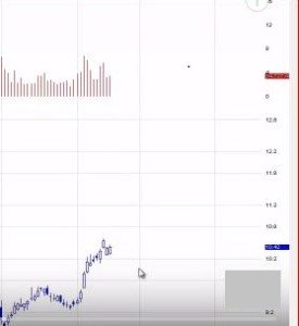
Each one of these bars represents one day of movement in the stock price and you can see over here it says 10.42 which is ten dollars and 42 cents as of today when it closed and that’s how much one share would cost; but throughout the day it actually when up to 10.70 and came down to 10.30, so you had this forty cent range throughout the day. It actually forms a candle and the candle is as big as the range of the day.So, basically each candle on this daily chart represents the range of the stock in that particular time frame. Now there are different time frames that you can use; daily means throughout the whole day. So you could use a five-minute bar or time frame and each candlestick would represent five minutes time.
Now the next thing we have to understand is how to predict the movement of stocks from a chart. How do we know that the stock is actually going to move from here to here or where should you buy or should you sell and how does it all come in just looking at a chart like this? Unless you really know the company or unless you worked there or felt like you knew something better about what you’re looking at, you have really no clue about what you’re looking at here. So that’s why a lot of traders start with learning the basics or the fundamentals.We have to learn what the trend is, we have to learn about support and resistant lines and learn something about averages. These are the three topics that are going to be covered here.
Trend Lines
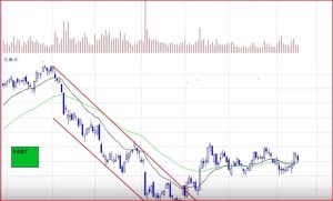
The first fundamental aspect, one that is really important, is to determine what type a trend you have.A trend is basically when something is trending it happens in a row over a period of time. When trending happens we can have two types of trends; we can have a downward trend or we can have an upward trend and that’s usually over period time that we start to see recognize that the price level here is moving down so we have a downward trend happening until finally we break that downward trend and now we have this kind of upward trend.

So, the most important thing here is recognizing how to recognize trends; trends are just basically a line connecting two pivot areas and a pivot area is really an area where the market might move up to a level and then pull back or move down to a level and push up.It leaves a little angle there, a corner, and a corner represents a pivot.So, every time a market comes down and bounces or pushes up and pulls back that leaves pivot area and from that pitch you just draw a line;if that line is pointing down you know the trend is down and if the line is actually pointing up then the trend is up.That’s the basics of just following the trend and understanding what the trend is.
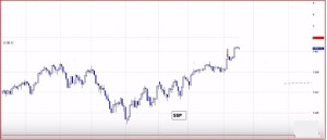
Here we have a chart of the S&P 500 index; this is the group of stocks that are traded in the S&P, what we call the S&P 500. 500 stocks and this is the average of those and can be traded just like anything else.We can just consider it as a basic chart that can help one understand how the market is moving.And since we now have a good understanding of trend we could just take this as another example of a trend.
Basically, we taking a pivot area, there are multiple pivot areas here as we can see, that are very closely bound up. So, we are going to try to connect those pivot areas to get the trend. In this case, it is an upward trend.
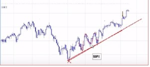
If we look at the graph closely we can notice that each time the prices pull back a little, they push a little higher. So as long as you have got you trend line representing that you got one part of the formula there. The second part of the formula is understanding where the trend pushes up to. So, each time we get a move up, we run it to a level and then pull back to the trend line. Again we run it to a level and move back to the trend line; that’s how you develop and get strength on that trend.

And each time a trend is to touched, it gets tested and it becomes a little bit stronger and each time it comes down you can actually take a trade of that.
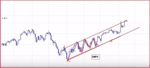
Then again there’s also another side to the trend and that’s where the stock is going to each time it pushes up. Now we have two channel lines or trends and that really represents the way the stock is trading.so thus by learning where the trend is you could develop a couple different trend lines that represent a channel and then from a channel can actually break down the stock movement and actually see on smaller time frame the market movement.So now we start to track a little bit better and understand it.
Because we know how the stock is moving there’s probably a good chance of the stock going down at the final level because it at every peak point it moved down a couple of points at various places on the chart, so we can almost certainly say the next stage is for the stock to actually move down.And again knowing this wemight be able to actually even profit of it by knowing in which direction the market is going to move based on these trend lines.
So, understanding trend lines is a very important or we can say a very basic thing; most charts will form a trend. So, all you have to do is connect the pivots. Some trends last longer than others but once you recognize a trend you will have an opportunity to trade off on them.So, when it concerns trends the most important thing to remember is to develop trend lines you need two pivot areas using which we make that extension called the trend line.
We can have two trend lines one on the top side of the chart and one on the bottom. And every time the price of the stock comes up to the top line there is a chance of a reactionary trade-back down. So, in all possibilities the price is going to come down once it touches the top trend line. So, it is obvious that trends and identifying trends is very important because it leads to figuring out what kind of channel it is. And from that point you can actually start to read the map a little bit better.
Moving Averages
The next section we’re going to talk about is moving averages.You might have heard of this term or you might have not; it is positively related to stocks and the stock market. What moving average does it tracks the price history; each candlestick on a daily represents the range of the day
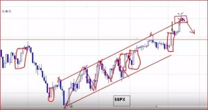
So, say we’re looking at the S&P chart and for a day the range is from 1305 to 1325; so it had a range of 20 points for that day. So, that’s what the height of the candlestick measures.A moving average roughly measures the price over to a time frame.
Normally the most active and the more popular moving averages are to 20 period moving average, the 50 periods moving average and 200 period moving average.As the name suggests the twenty periods moving average or the 20-day moving average when viewing on the daily chart represents the past 20 days;to get this average all the prices for a period of 20 days or 20 time units (depending on the type of chart)are added up and divided by 20 and it gives you an average, which is the 20 period average.And in a similar manner the 50-period average and the 200-period average are calculated.So to get the averages all one has to do is take each one of these candlesticks,add up the price, the closing price that is, and divide it by the number of days and that would give you the average.
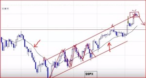
Each day the moving average line will go up with the price. So to actually see the moving average line we have to take the moving averages in the ones called my overlays and on to my chart and we are going to use the standard 20 period and we can see how that one just plotted itself right there as a black line in the middle of the chart.
Similarly, if we plot the 50-period moving average line too, we get it similar to the 20 periods one; it is represented by the light green line
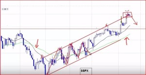
Looking at both the lines we can see the longer the time frame the more that moving average line is staying away from the price level; right now the quicker one, the 20 period line remains closer to the price.But one thing you can notice now that you see two moving averages here, especially the 20-period moving average which is very valuable because there are a couple things that you can look at.
Lots of times the stock that moves away from the average comes back to the average, and this is repeated a number of times throughout the chart.So, it is always looking towards its mean or median area. And when we’re able to recognize a channel and put that moving averages in there, all of a sudden we’re looking at two different things in there that kind of help us guess the direction of the market.
Lots of times the moving average could be used as support and by support it means that when a price level comes down and moving average is such a known entity in the market and other people see that and then we have this kind of self-fulfilling price level being held up by this invisible average. Why do we say invisible is because though it is placed there on a graph, in reality it isn’t tangible things.Yet the price actually holds this and it can top off continuing to move up to a top of the channel line.So, that your 20 periods moving average; it kind of just represents the average of the past 20 days plotted on the line.The line too is then plotted and it just overlays the chart action.
A lot of times you’ll see that the 20 period moving average continues to be tested by the price;the price will pull away and then push up to it and it might push away from it and then pull back to it and this continues to happen back and forth.The 50-period moving average is a little bit stronger and the 200-period moving average, which will be plotted below the 50 periods one, is even stronger than that and those act the same way.Sometimes they are even stronger because they have more data behind them; fifty days versus twenty days or two hundred days versus fifty days will make us more reliable average.
So, that’s the basic concept of moving average.You could use moving averages to trade off or you can use the moving averages to actually see the trend as basically average moving up or average moving down.It’s a very highly reliable and easy to follow indicator. So, the combination of knowing your channels, trend lines and moving averages are giving you a little more detail on how this chart is working out.
Support and Resistance
In this next section, we’re going to concentrate on a topic called support and resistance.
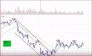
Support and resistance are two important terms in the market.This concept represents a more of the history of the previous price action; like when a stock moves up to a certain level and pulls back or when it pulls down to a certain level and then bounces.Each time that does something like that first we start putting in those pivot areas.But also if we look at those pivot areas each one of these levels becomes a level in the history of the stock. When those levels start to add up then we start to say there’s more weight to this average.
There is more weight to this level shown above because right now we are trying to develop a series of tops here and this develops what we call resistance
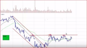
So, we can see that the price is seeking to push through this but when it comes up to that level, it is pushed back.And the same thing happens at the bottom part; we can see various areas that form excellent pivots
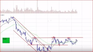
Looking at it carefully we can actually see that the price kind of gaps down and then it is pushed higher and we can see that it actually reacts offer multiple levels.It makes sense now that this is a really starting to develop its support level.It has to be tested a few times really to take hold; just because it went there once doesn’t mean it ‘s right.There is a little chance of a little resistance to getting up that level but until we actually put another point of interest up there compared to that one then it becomes a more reliable one.
If it is just a single point we shouldn’t count on it alone because at any point it can play up. But once it is two or more than the fourth one becomes a more viable area to look for a reaction off that.So that is actually the basics of support and resistance; understanding that levels that once tested get tested again and if they hold up they become more actively important further on in the chart. So, if you actually get to that level again you take a trade offer at that.
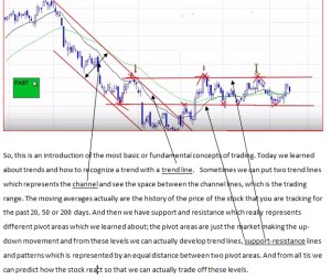
So, this is an introduction to the most basic or fundamental concepts of trading. Today we learned about trends and how to recognize a pattern with a trend line. Sometimes we can put two trend lines which represents the channel and see the space between the channel lines, which is the trading range. The moving averages actually are the history of the price of the stock that you are tracking for the past 20, 50 or 200 days. And then we have support and resistance which really represents different pivot areas which we learned about; the pivot areas are just the market making the up-down movement and from these levels we can actually develop trend lines, support-resistance lines and patterns which are represented by an equal distance between two pivot areas. And from all tis we can predict how the stock react so that we can actually trade off these levels.
